 With thanks to Michael Webster and Bevil Conway at the University of Nevada, we now have a solid explanation on why some people saw the dress as white and gold and others perceived it as black and blue:
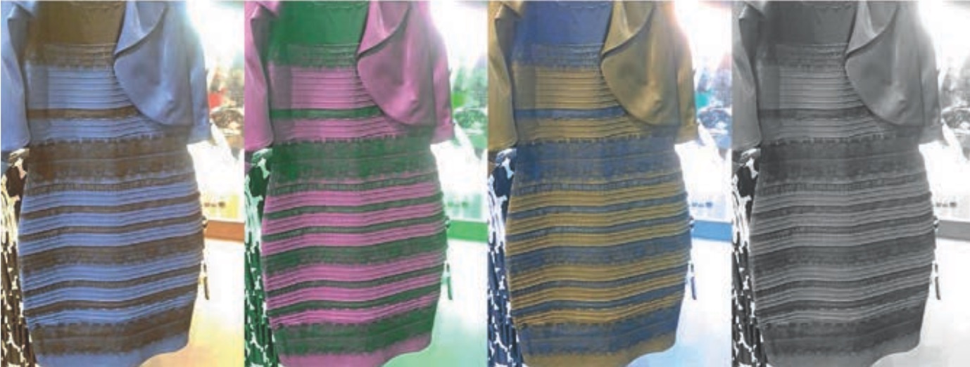
Three Perspectives on “The Dress”
When you look at this photograph, what colors are the dress? Some see blue and black stripes, others see white and gold stripes. This striking variation took the internet by storm in February; now Current Biology on May 14 is publishing three short papers on why the image is seen differently by different observers, and what this tells us about the complicated workings of color perception.
Individual differences in color perception uncovered by “The Dress”
For neuroscientists like Bevil Conway, “The Dress” phenomenon marked the greatest extent of individual differences in color perception ever documented. It’s long been known that certain optical illusions can cause us to see two different shapes in the same image (e.g., a face or a vase), but what makes “The Dress” photograph so mind-blowing is that it’s the first time a single image could be seen by different people as wholly different colors.
“It caught fire because it was a case in which color wasn’t doing what we expect,” says Conway, who teaches at Wellesley College and the Massachusetts Institute of Technology. However, the #whiteandgold versus #blackandblue debate on social media wasn’t scientific proof as to how different we each perceived “The Dress.” To find out, Conway and his team designed an experiment in which they asked people to identify the colors they saw on “The Dress” from a full palette.
In a survey of 1,400 individuals, with over 300 who had never seen “The Dress” before, Conway and his team found impressive individual differences in color perception; they also found, surprisingly, that people fall into one of three camps corresponding to the main groups identified by social media: a blue/black camp, a white/gold camp, and a smaller blue/brown contingent.
“It could have been the case that you had a continuum of perceived colors, but if you plot the colors people picked, you see two main clumps falling into the two categories for what words people used to describe the colors of ‘The Dress,'” says Conway. “This shows that the perception of the dress is variously stable. By studying the pair of colors in ‘The Dress,’ we can answer the age-old question: do you see colors the way that I see them? And the answer is sometimes ‘no.'”
Another finding from the survey was that perception differed by age and sex. Older people and women were more likely to report seeing “The Dress” as white and gold, while younger people were more likely to say that it was black and blue.
Conway believes that these differences in perception may correspond to the type of light that individuals’ brains expect to be in their environment. For example, people who perceive “The Dress” as white and gold may have just been exposed to natural daylight, while those who saw a black and blue garment may spend most of their time surrounded by artificial light sources. The brains of those who saw a brown and blue dress are likely used to something in between.
“The big open question is what causes these differences in the population,” Conway says. “One framework for understanding why you get these variations is to consider how light is contaminated by outside illumination, such as a blue sky or incandescent light. Your visual system has to decide whether it gets rid of shorter, bluer wavelengths of light or the longer, redder wavelengths, and that decision may change how you see ‘The Dress.'”
The many colors of “The Dress”
In the days after “The Dress” was posted online, a group led by psychologist Karl Gegenfurtner at Giessen University in Germany asked 15 people to view the photograph on a well-calibrated color screen under controlled lighting. The participants then had to adjust the color of a disc to correspond to the colors they saw in the photograph. For the lighter stripe, participants reported seeing a continuous range of shades from light blue to dark blue, rather than white and blue, the two dominant colors reported so far.
“The question should thus not be whether the dress is blue or white, but whether it is light blue or dark blue,” write Gegenfurtner and his co-authors. “Despite the continuous choice of matching colors, observers are consistent in calling the dress ‘white’ when their match lies above a certain brightness and ‘blue’ when it lies below.”
Gegenfurtner’s team also found that all of the colors observed in “The Dress” correspond very closely to those found in daylight, adding support to the theory that how the eye interprets natural sunlight is what triggered #Dressgate 2015.
The special ambiguity of blue
Would “The Dress” have gone viral had it been #greenandblack or #orangeandblack? Not likely, argues cognitive scientist Michael Webster at the University of Nevada, Reno. He believes that the photograph is part of a growing body of evidence showing that the human eye is more likely to confuse blue objects with blue lighting.
For example, if you stare at a gray object and make the gray increasingly yellow or blue, then you’re more likely to see the object as yellow than as blue. This difference likely comes from how the eye evolved in the presence of natural lighting from the sun and the sky.
To test this, Webster and his research team surveyed 87 college students on what color they found the light-blue stripes of “The Dress” to be. The participants were split about fifty-fifty between white and blue. The researchers then inverted the image of the dress so that the black stripes appeared blue and the blue stripes appeared gold. Of those surveyed, nearly 95% said that the stripes were yellow or gold.
“We discovered a novel property of color perception and constancy, involving how we experience shades of blue versus yellow,” write the authors. “We found that surfaces are much more likely to be perceived as white or gray when their color is varied along bluish directions, compared to equivalent variations along yellowish (or reddish or greenish) directions.”
So how we perceive colour can vary due to a range of factors. Not exactly news but there it is.
Speak Your Mind